Wecrews –Redefining Automotive Assistance
Industry
Automotive Assistance & Services
My Role
Web & Mobile Application
Client
Wecrews
Objective
Enable vehicle owners to quickly request help and track service during emergencies.
Project Overview
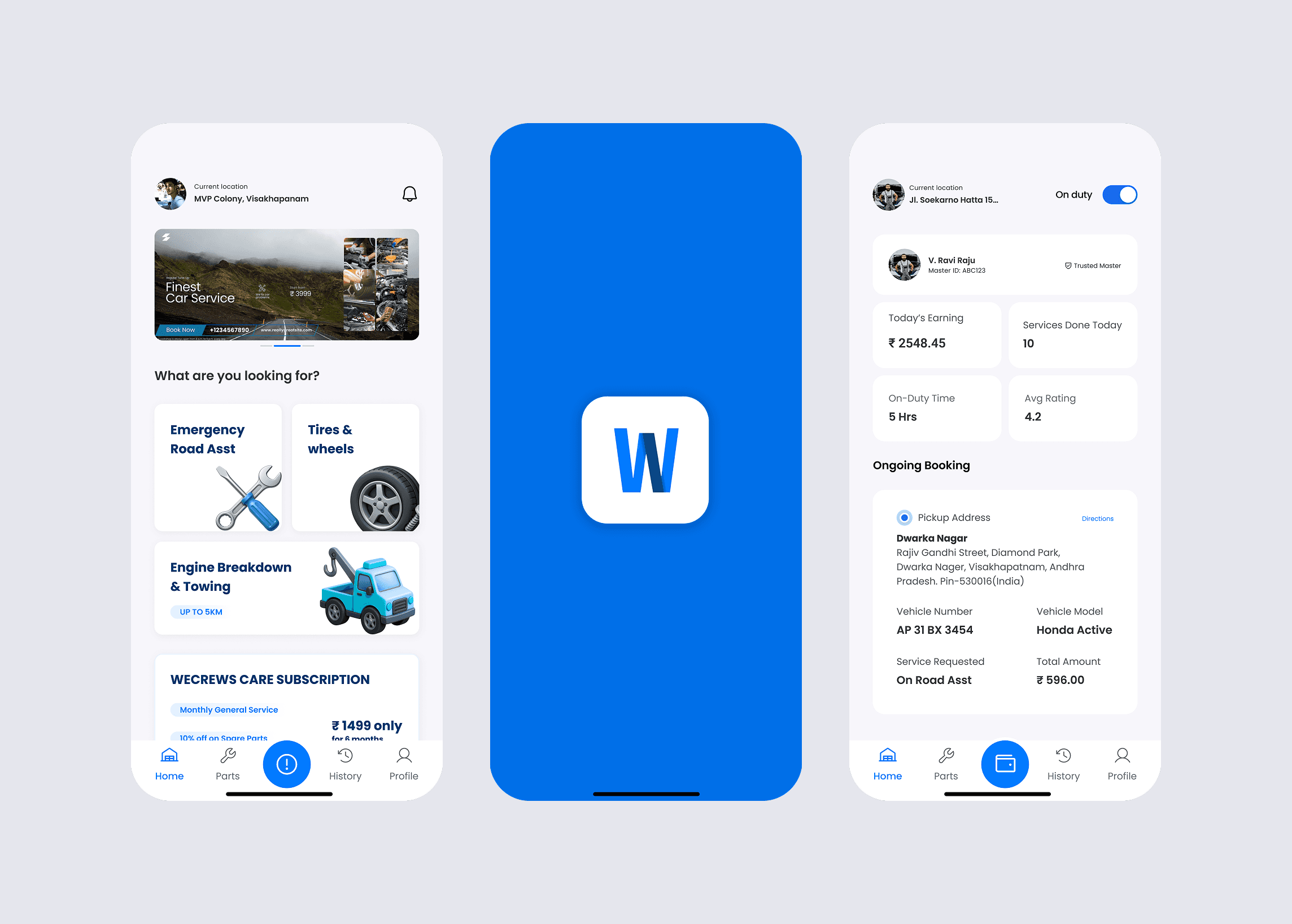
Wecrews is an automotive assistance platform designed to connect vehicle owners with nearby service providers for breakdown support and maintenance help. The goal of the project was to simplify the process of requesting assistance and reduce confusion during urgent situations. Unlike normal apps, users interact with this platform under stress. A breakdown scenario requires speed, clarity, and reassurance. The design needed to help users understand what to do immediately without thinking too much.
The Problem
When vehicles break down, users do not have time to learn an interface. Existing service-request flows often require too many steps, causing delay and frustration. Users struggled with: knowing which service to select understanding whether help was confirmed tracking when assistance would arrive The biggest issue was uncertainty. Without clear feedback, users felt anxious and unsure if help was actually coming.
Key Challenges
When vehicles break down, users do not have time to learn an interface. Existing service-request flows often require too many steps, causing delay and frustration.
Users struggled with:
knowing which service to select
understanding whether help was confirmed
tracking when assistance would arrive
The biggest issue was uncertainty. Without clear feedback, users felt anxious and unsure if help was actually coming.


Users
Primary users were daily commuters and travelers who needed immediate roadside assistance. Many users were non-technical, so the interface needed to work even for first-time usage without instructions.
The experience had to be:
fast
reassuring
easy to understand
My Approach
I designed the experience around one main idea: reduce decision time.
Instead of presenting multiple options, the interface prioritizes the primary action — requesting help. Every screen answers a simple question:
How do I get help?
Is help coming?
When will it arrive?
The goal was not just usability, but emotional reassurance.

Key Design Decisions
• High-visibility primary action button
• Large readable typography for outdoor usage
• Status indicators showing service progress
• Minimal text to reduce cognitive load
• Real-time feedback to build trust
These decisions ensure users understand the situation instantly.
Visual Design
The platform emphasizes feedback. Each action triggers a clear response so users know the system is working.
Examples:
request received
provider assigned
assistance on the way
arrival confirmation