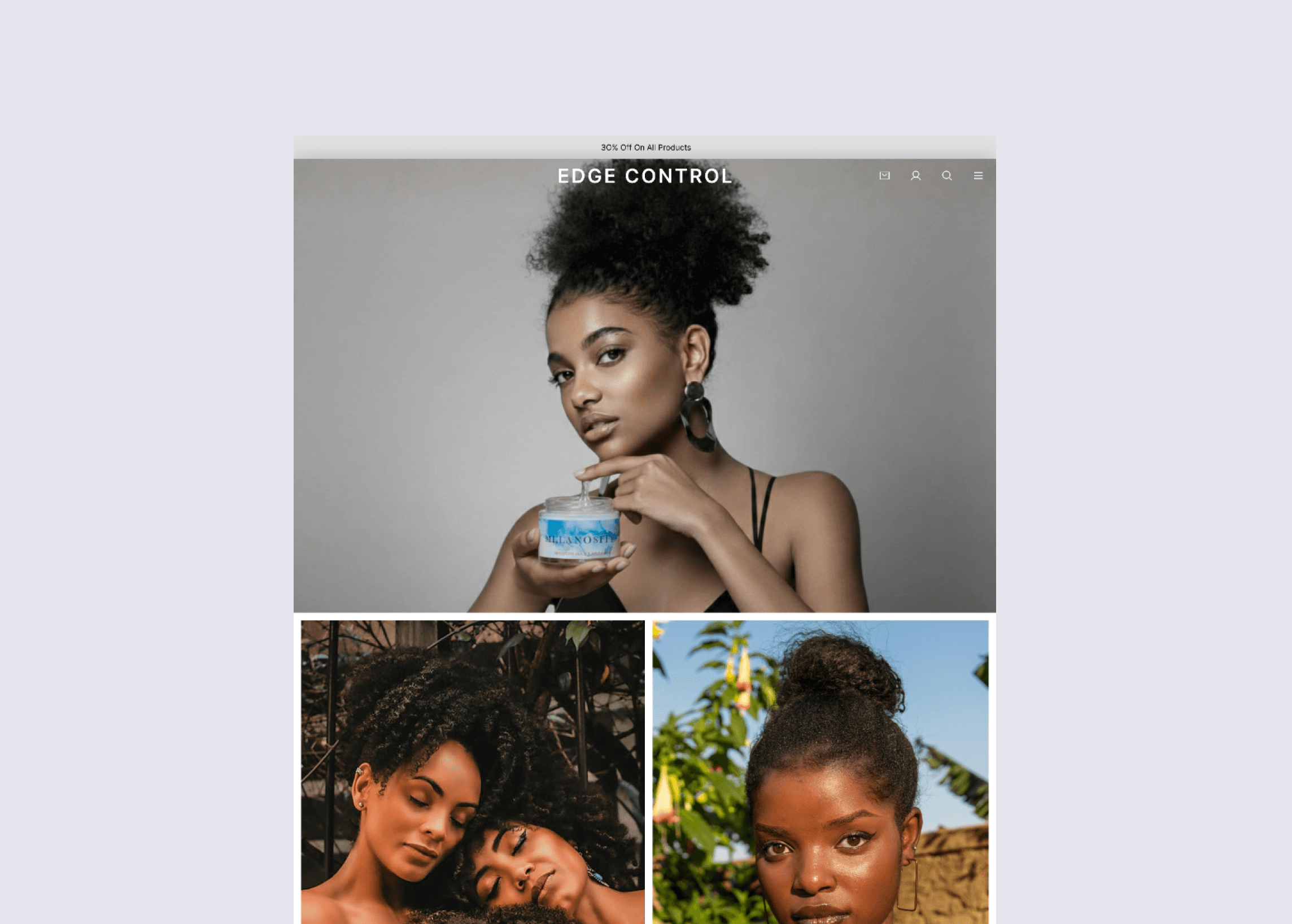
Edge Control — Culturally-Driven Hair Cosmetics E-commerce Platform
Industry
Hair Cosmetics & Beauty
My Role
UI/UX & Interaction Designer
Client
Edge Control
Objective
Improve product discovery, reduce purchase hesitation, and create a brand-aligned shopping experience.
Project Overview
Edge Control is a culturally expressive hair cosmetics brand offering modern styling products. The goal of this project was to design an e-commerce platform that communicates the brand personality while making shopping simple and confidence-driven. The platform needed to balance two things: strong visual storytelling and usability. While beauty brands rely heavily on aesthetics, customers still need clarity when choosing products, especially when multiple variants and use-cases are involved.
The Problem
Users visiting beauty e-commerce stores often struggle to decide which product suits them. Product pages usually emphasize visuals but fail to provide clear guidance, leading to hesitation before purchase. During analysis, the major friction point was decision-making. Users could browse products, but they were not confident about what to buy or why a product was right for them. This uncertainty interrupts the purchase journey and increases drop-offs. The brand required a shopping experience that not only looked premium but also built trust and helped customers quickly understand product value.
Key Challenges
• Users unsure which product variant to choose
• Over-reliance on imagery without supporting explanation
• Lack of strong trust indicators
• Decision fatigue while browsing multiple products
• Friction in moving from browsing to checkout


Users
Primary users were young customers interested in hair styling and self-care products. Many were first-time buyers unfamiliar with technical product differences, so the interface needed to educate while selling.
The experience had to be:
simple to understand
visually engaging
confidence-building
My Approach
I approached the design by focusing on clarity before aesthetics. Instead of starting with visuals, I structured the user journey: discovery → understanding → trust → purchase.
The main goal was to reduce cognitive load. Each screen needed to answer a user question:
What is this product?
Is it right for me?
Can I trust it?
How do I buy it?
By guiding users step-by-step, the interface helps them move naturally toward a purchase decision.

Key Design Decisions
• Large product imagery to communicate brand identity
• Ingredient highlights to build credibility
• Structured product descriptions for easy scanning
• Consistent typography for readability
• Prominent primary CTA (Add to Cart)
• Minimal checkout steps
Visual Design
The visual direction used clean spacing, confident typography, and focused layouts to reflect the brand’s modern personality. The UI avoids clutter so attention remains on the product.
Instead of overwhelming users, the design emphasizes:
readability
clarity
hierarchy